
Lola’s Rambings is a feature on Lola’s Review where I talk about me or ramble on about a book or non-book related topic. Usually these posts are everything that doesn’t fall under any standard header, like blog tours, book blitzes, cover reveals or reviews. Lola’s Ramblings posts are are personal discussions of a certain topic. Sometimes about book related topics and sometimes about non-book related topics. This feature was previously known as About Me. The banner for this feature is designed by Michelle from Limabean Designs.
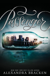
Book covers are one of the things I love to talk about. Although I hardly take the time to do so, with the exception of my cover reviews during cover reveals. During those cover reviews I notice that there are some points or topics I often address, so I thought it would be nice to have a discussion post about covers and mention those points I like to see on covers. I like how book covers can give a hint about the content of the book and when I look at a cover I like trying to deciper what it tells me. I think a good or bad cover can really make or break a book. There are some covers that are so bad I immediately lose interest in the book or covers that are so good that I want to read them no mater what. For example the cover of Passenger, the cover is so pretty I want to own it. So I think book covers are pretty important and today I want to talk about what makes a good cover in my opinion and next week I talk about things I like to see on a cover.
What Makes a good Cover?
First I want to talk about what makes a good cover in my opinion. With a good cover I mean that it looks good, I don’t have to like the cover personally, but I can see it’s a good cover for the book. These are things I think a cover needs to have to be appealing to readers and get picked up. Most of these are also things I like in a cover.
 Gives hint towards genre or subject. I like seeing some hint towards the genre or subjects on the cover. And often I make assumptions were the story is about from what I see on the cover. Does the cover has a puppy and a couple dancing? Then I am assuming it’s a contemporary Romance and that the puppy will make an appearance in the story. From what I’ve seen in the comments on my cover reveal posts so far, most people agree with this. I don’t say every romance book needs a kissing couple or every New Adult book needs a black and white cover, but in general I do like to know at least something about the topic or genre from looking at the cover. It doesn’t have to be cliché or fit the stereotypical image of a book cover for that genre, but I also think thsoe themes or stereotypes serve a goal, namely letting the reader know what type of book this is. Or at least not be misled by a cover, ever take a look at a cover and expect one thing and then get something totally different? That. I prefer covers that give no hint about the genre or topic than covers that give the wrong hint about the genre. If there is a puppy on the cover and the main character has ten cats, I think that isn’t a good cover.
- Eye catching. I think you have a good cover if it’s eye catching. If people see the book on a blog, in their feed or in a bookstore and it makes them pause and take a closer look you have a good cover. You want your cover to appeal to people, not have them ignore it. You want people to pick up your book because of the cover and what it tells them. I think having an eye catching cover can help make your book stand out in the sea of books, making sure people take a closer look is important and I think the cover is one device you can use to attract their attention and maybe catch their interest.
- Title and author easily readable. This is pretty obvious, but I thought it was worth mentioning anyway. I want to be able to read the author and title clearly. I have seem some crazy fonts that made the text unreadable or not enough contrast between the text and background. You want readers to be able to read the title of your book at one glance, not having to puzzle what the title or author is. You can also use the fotn as a way to stand out or add soemthgin extra to the cover.
 Fits the book/ story. I love it when a cover fits the book or story and I think this is certainly part of a good book cover. I have seen covers that seemingly have nothing to do with the story or book. It’s okay when you have to read the book first to udnerstand the connection, but I want the cover to sort of fits the book and story inside. Else why make it the cover for you book if it doesn’t fit? I’ve seen some generic covers that sort of fit the book, but when there are little details on the cover that hint towards events or objects in the book that’s even better. On the other if your main character has blond hair and the cover shows a brunette, that’s just a bad cover decision.
- Same style for covers in a series. I want to see a cover and know it belongs to the same series as the earlier or later books in a series. I love it when covers in a series have the same style, models, font, design, so I can see that these are part of a series. I like seeing the covers in a series next to each other and seeing the trend of style that’s the same on each cover, but also enough differences to differentiate the different books.
- Nice/ professional design. You know those covers that you take one look at and can see the author tried photoshop herself? The elements don’t fit nicely or things are just a little bit off. There are also authors who do a great job designing their own covers and I have seen enough of those to say it’s definitely an option, but just make sure you know what you’re doing. A cover is important and if it looks weird or ugly or obviously badly photoshopped, chances are that isn’t appealing and a reader is less likely to pick it. I want the cover to have a nice design, you can see that there is effort and though put into what ends to go where and the elements are nicely arranged.
Covers Featured in this post.
As this post is about covers I picked a few covers I like to display during this post and let me tell you why I picked these covers.
- Passenger (Passenger #1) by Alexandra Bracken. What’s not to love? Nice sea setting, dark background and then the message in a bottle hint, but instead of a message there is a city in the bottle and the reflection is a ship, which is so cleverly done. This cover makes me think of dark themes, travel, seas and ships. It reminds me of the past, with the ship and the way the ship is the reflection fo the city can be seen as a hint to the time travel aspect, with how the main character switches her city in the here and now for a ship in the past. I love this cover and how it hints to the story and content. I can’t judge whether it actually fits the story, but I really hope it does. It’s a shame the mention of time travel has me running in the opposite direction, still if this one would be on netgalley I am not sure if I could resist hitting request. If only for that cover.
- Summer Haikus (Happily Ever Asia) by S.J. Pajonas. This is one of my favourite romance book covers. I love the train background, city setting it means and traveling. I like how happy the couple looks and how they are hugging instead of kissing. They are also both asian, which fits the descriptions of them/ I like the font and those little hearts. It gives the cover a cute and romance feel.
Fitting the story is really huge for me. I just read a book that had two pretty much naked people on the cover but there was no sex n the book. I found that really strange. I really don’t like headless torso covers either. I like there to be an entire face not just a chest.
I agree, why have a cover that doesn’t fit a book. With a cover with pretty much naked people on it I would except a heavy focus on romance and some sex as well indeed. It depends a bit on how the headles torso is done, I recently had a historical romance cover with a female in a dress without head and I didn’t mind that, but the nakes chest and no head is a bit overdone.
I agree with all the points that you mentioned. Sadly, there are some book series that have the same theme for the cover but the SIZE, sometimes the other book is a few millimeters longer.
Oh yes I hate it when the size is different, I have the whole Bloodlines series in the same format except for the last book, which annoys me a lot. I mean why do publishers think that’s a good idea?
I do want the cover to fit the story, but I don’t want it to give anything away. For example, if a cover for Twilight had had vampires on it, I would’ve been sad because I knew nothing going into it and I liked discovering Edward’s secret along with Bella. So, if there’s no way to fit the story without spoiling the story, then the other factor for me is that it needs to be pretty and designed well. I’m one of those readers that will pick up a book based solely on its cover, so design is important to me.
I agree it’s best if a cover fits the story, but not spoil the story or reveal things. I do like it when there is a seemingly normal object on the cover and it get’s more meaning because it has a role in the story.
Although with Twillight the blurb did give it away that there were vampires if I remember correctly. I do think the cover for twillight was dome well, a bit vague and it might not fit the story perfectly, but it was a pretty cover. I think I picked up twillight based solely on the cover and seeing someone read it during lunch break on my work. The cover is definitely important for me.
Agree with all your points. I think my biggest need from a cover is that it has a strong connection with the story and isn’t just about selling. I am not one that has to have sexy people (though I will never say no to that bit of eye candy) on a cover to make it eyecatching, but like you, I want it to look professional. I also get annoyed when I start to see copy cats to creative cover designs.
I love it when a series has a series of covers that connect and obviously belong. Some of my favorite covers are the Patricia Briggs’ Mercy Thompson and Alpha & Omega covers as well as Charlaine Harris’ newest series Midnight, TX because you can find hints to the plot twists right there in the cover.
I agree I prefer a cover that fits the story and find that more important than it looking nice just to sell. Although even better if the cover is eye catching and fits the story. I think having a professional looking cover is very important. There are a few cover pictures or models that show up too often and then it get’s annoying as I often associate a cover with one book and then it’s weird to see another book with almost the same cover.
The Mercy Thompson covers are pretty nice and have the same style. I haven’t read Charlaine Harris her Midnight series, but I do like the covers. They look great and that’s even more fun if it contains hints, that when you book you find even more meaning in the cover.
It really must be eye catching and I find that Middle Grade covers are the most eye catching. Something about the colors and they cartoon look always draws me to them. I guess that is one way to catch a kids eye.
I like when the covers match in a series. Like each one is an extension of the next one. Those always make me want to read the book more. I am not a fan when the covers don’t match.
Great post, Lola! 🙂
I love Middle Grade covers, they are often so much fun and they tell a bit of the story or display a scene. I also like they have a more cartoonish style, which makes it easier to have the characters fit the descriptions than with real life models.
I love it when books in a series match, it just adds something and it’s fun to see the cover in a row and see how they match in style.
Great points, Lola!
I agree with your points, personally I want it to look professional and not like a picmonkey/Windows Paint project. Also, if you’re using stock photo, still exercise some creativity and edit the photo. Don’t justslap the title and your name on it and consider it done.
Indeed! Nothing wrong with using a stcok picture, but at least add or change it a bit. I feel like some indie authors make an easy cover as they think it doesn’t matter, but less people pick up your book if the cover looks bad. I think having a good cover is very important.
I agree with you. I need a cover to fit the genre and have some style to it. I agree with Braine, if you’re using a stock photo (I understand that not everyone has the budget for a model photoshoot), but at least change it up some so that your cover isn’t exactly like someone else’s.
Some of my favorite covers are done by Dan Dos Santos. He does all the artwork for Patricia Briggs’ Mercy Thompson (new cover revealed today on her FB page) and Alpha and Omega series and Diana Rowland’s Kara Gillian and White Trash Zombie (my favorite covers of all time) series. He also just started doing a new series for Lilith Saintcrow called Gallow and Ragged.
Not only is his artistry beautiful, he takes the time to read the books and really get to know the characters so that he can make the covers really match the world that the author created.
A custom photoshoot is probably very expensive and nothing wrong with using a stock picture as logng as you still make it your own cover. It’s annoying to see those covers aroudnt hat look exactly the same.
I love the Kara Gillian covers, so pretty! I didn’t realize he was the same artist as Mercy Thompson, but now that you mention it I see the similiarities in style. The Mercy Thompson covers are very pretty indeed. I like how the characters look realistic and not too cartoonish and fit the exact descriptions of the characters in the book. I didn’t knew he actually read the book, that’s awesome! I have read soem of the Kara Gillian books and always liked how the cover looks like a scene from the book and all the details fit.
Check out this great post he did on his blog about the cover he did for the most recent White Trash Zombie cover. I could be wrong. I thought I had read where he explicitly stated he read the books. I think it is the line “while still capturing some of the flavor of the actual book” that made me think that. Anyway, it is great to see his process. http://muddycolors.blogspot.com/2015/08/white-trash-zombie-gone-wild.html
I might have to start following his blog, I love hearing more about the story behind the cover. So interesting and I like seeing the initial ideas and how and why they changed things. He sure seems to put a lot of work and effort in the cover he creates. Thanks for sharing that post, it’s great to see his progress :). I wish more authors or cover designers did posts about their covers.
Yeah, I definitely agree with all of these things! Love love love the cover of the Passengers, it’s so unique and just is gorgeous in general. Professional covers are a must for me, I know you aren’t supposed to judge but if I get a request and the cover is just one color with the title on it I’m like ehhhhhh. I’m also loving the watercolor looking covers that have been coming out recently!
I love the cover for Passenger, it’s a shame it doens’t sound like a book I would enjoy, but even so I am still a bit tempted to buy it just so I can have that cover on my shelf. I’ve had a few rveiew request where I took one look at the cover and thought no. An unprofessional cover looks like the author didn’t thought it was worth it to spend money on a good cover. And knowing how important covers are I think investing a bit of money to have at leats a professional looking cover is worth it. I like the watercolor style covers too, they are very pretty!
All of your points are good points, Lola. I have to admit I don’t always pay attention to covers, especially for kindle books – but like others, when I look at a cover, it’s good to let me be able to guess at least something (correctly) about the story inside.
And if I buy paperbacks or hardbacks, I would like a series to go together, both when it comes to size and colors.
I think the time I paid the most attention to covers lately was during the summer COYER challenge, for the scavenger hunt 😀
Have a great weekend, Lola.
I love watching covers, it’s not the only factor to help me decide whether to read a book or not, but I still like seeing the cover for a book and trying to see hints about the story in it. The cover is part of a book and in my mind and I always look at the cover as well. Yeah the Coyer scvanger hunt had some fun cover items to find.
Great post, Lola! And thanks for including Summer Haikus. It’s interesting that you think it fits the story perfectly (so do I) but I often wonder if it’s the reason the book isn’t selling. You know I write stories about Japanese people mostly and so if I’m going to put people on my covers, they should be Asian at the very least. But I wonder if having Asians on my covers is the reason why the books don’t sell? Maybe it’s unconscious discrimination and I’d be better off with no people? I don’t know. It’s a struggle for an author to hit all the points you highlight in this post and still have the book appeal to the right audience.
Hmm I don’t know, there is this whole movement towards more diverse book, so I would think having asian people on the cover would be a good indication of a diverse book and people would like that? I think the Summer Haikus cover is one of my favourties of your covers, I love how well it fits the story and I like their pose.
Appealing to the right audience also would’ve been a good point to add. I remember a NA romance book I read a few years ago and I loved the book, it had a very sweet cover in colour with a couple from the back walking hand in hand. It think it wasn’t selling well till the author changed the cover to a black and white kissing couple cover. I guess people who look for NA romance books look for that cover look and I think when she changed the cover it sold more, but I still like the older cover better as I think it fits the story more and I like the more stubtle romance covers. So I guess going with what’s common or normal in a genre for a cover can help the book sell.
I think putting no people on the cover can also go the wrong way as usually people on the cover means focus on the characters/ romance and without that people might not know it’s a romance book. It’s hard to know for sure what sells and what not. And even with a good cover a book might not sell, but I do think that having a good cover is important as bloggers do look at a cover. If you have a one colour cover with only a title that won’t attract readers to give it a try.
And in my opinion your books have great covers!
I want to believe in the diversity movement, I really do. But I don’t see it making much of an impact, much like the way to make NA more diverse (beyond contemporary romance and certain tropes) didn’t really work either. I want to believe people won’t discriminate against my books because they’re about Asians, but I have a good suspicion they do because I put the people right on the cover. I don’t know. I’ve very conflicted about this whole subject because I’m between a rock and a hard place. So I’m really looking forward to trying a new genre. 🙂
On the blogs I visit I see lots of talk about it, ofcourse I am not sure how much of an effect it really has, but from what I’ve been seeing more and more people are focussing on diversity. Ofcourse diversity is still a broad term and it depends on the bogger in which diverse direction they go, as everything from LBGT to mental illness to different cultures falls under the heading of diversity.
I like reading and learning more about other cultures and countries and love how books can show me those places and people I will likely never meet in real life. So I often assume others will too. But then again maybe I have a different position as for me most books are different cultures to me as I live in the Netherlands.
I still hope the NA diverse moment will gain some ground, maybe it just takes time. I have read some great NA books that aren’t contemporary romance, but they are harder to find. And contemporary romances in general are selling well nowadays so maybe once the focus shifts the same will be true for NA genres.
It has to catch my attention. If the cover is plain or fade-into-the-background bland, I’m less likely to pick up the book to see what it’s about. (I picked up The Selection based on cover alone…bad me!)
It also has to fit the book and the characters. So something scary and dark on a book that has no ghosts or other scary things in it is going to annoy me. And when they have a person on the cover who doesn’t match the description of the character is another big no-no. I have one book that has a pretty girl with bright blonde, curly hair and blue eyes on the cover. The girl she represents? Is described as having straight brown hair and green eyes. Major fail.
I also like when the title of the book stands out more than the author’s name. I mean, I want to know who wrote it, but if it takes me having to look at the entire cover in detail to figure out what the title is because the author’s name is huge, and they have other writing as well (like bestseller list info, newspaper blurbs, etc.). And then finally find the title hidden away somewhere in small font? Less likely to want to read it.
But the cover of The Selection is so pretty! And it actually fits the story as well. I sometiems pick up a book solely based on the cover as well.
That really annoys me when the person of the cover doesn’t look like how the person is described in the book. or sometimes they do fit the description, but it still doens’t fit the image in my head.
I prefer if a cover only has the title and author name on it and no other writing as I think that isn’t necessary to have on the cover. And while both the author and title needs to be easily readable I think the title is slightly more important.
I like all your points, Lola. I do want the cover to be eye-catching – in a good way 😉 – and I like for it to have something to do with the story. I’ve actually read a book where the cover didn’t reflect the story at all and it was disappointing. I’m not picky about what a certain genre has on its covers…although I’m not fond of the new trend towards bright colors and cartoonish depictions of people and things. One of my favorite covers is Splintered. I haven’t even read the book yet but I adore the cover. 😀
I always am looking for the connection between the story and the cover and it’s disapointing when there isn’t any. Splintered is that alice in wonderland type story right? with the bright green colours and flowers? I like that cover too, even though I don’t think it’s a book for me. I like the cartoonish style covers for MG books, but I don’t think they’ll work as well for other age categories. I can’t remember seeing any cartoonish bright coloured covers lately or maybe I just can’t remember then at the moment.
THIS post though. I like eye catching covers, it doesn’t have to be anything fancy, sometimes a simple font works great as well. I can’t deal with most nude covers though where they’re headless. Awesome discussion post Lola!
Thanks! I think having an eye catching cover is very imprtant, although it’s also hard to definite exactly what makes a cover eye catching. I also agree with you that a cover doesn’t have to be fancy, sometimes it’s the simple covers I like most.
Cool idea for a topic!! I don’t know what I like in a cover other than when I see a good cover I just know! The covers I love are mostly beautiful and clean. I also love the cover of Passenger and it has made me want to read it, where previously I was thinking it didn’t sound like something I’d be into. I also love the cover of Pointe by Brandi Colbert. That’s a good example of the clean and pretty type of cover I like. But interesting font is also a thing that I go for a lot too!
Thanks! Often it’s more of a feeling indeed. I tried to put that feeling of what makes a good cover into word with this post, but it’s hard. A cover can definitely make me more likely to read a book if the cover is good. Interesting fonts is also something that can catch my attention.
I looked it up and the cover for Pointe is stunning, simple and clean, and very pretty! I like how it took me a moment to realize there was a girl sitting on the cover. Interesting use of light and dark it has!