
Lola’s Rambings is a feature on Lola’s Review where I talk about me or ramble on about a book or non-book related topic. Usually these posts are everything that doesn’t fall under any standard header, like blog tours, book blitzes, cover reveals or reviews. Lola’s Ramblings posts are are personal discussions of a certain topic. Sometimes about book related topics and sometimes about non-book related topics. This feature was previously known as About Me. The banner for this feature is designed by Michelle from Limabean Designs.
Last week I talked about what I think makes for a good cover, today I will talk about my personal opinion of what I like to see on a cover.
What I like to see on covers
Now we’re going to talk more about my personal likes for covers. These are things I like to see on covers or not. Things that catch my eye.
 Beautifull/ eyecatcing colours. In most of my cover reviews I mention colour, for me colour is very important on a cover and can catch my attention. I guess I am very colour focussed. It’s very personal which colours I like and it also depends on the cover itself. Colours can play a big influence in whether I like a cover or not. Sometimes it’s a combinations of colours or oen specific colour or how the colours are used.
- Nice background. I am not sure why, but background can be important for me on a cover. So many books have a boring background and I think a background can tell a lot about the setting and I find settings important in books, so I think that’s part of the reason why I like backgrounds. Sure the foreground is important, but I think a nice background goes a long way. Is it set into a city, out in nature, in a small town? Often with a good background you can tell a lot about the setting.
- No people. While I don’t immediately dislike covers with people on it, in fact there are awesome covers with people on them too, I have a strange fascination for covers without people. I often find the model on the cover doens’t fit my idea of the main character or I don’t like having already an imagine of the main characetrs before I even start reading. When the models fit the book I like it, but else I often prefer covers without models on them. If a cover has a models I prefer them to either fit the character descriptions or have a character shows fromt he side or back.
- People that fit character description. If there are people on a cover I think it’s a must that they fit the character descriptions. Ever read a book with a blonde girl on the cover and then you read the book and the main character has brown hair. That always makes me wonder why they didn’t change the hair colour or who the person on the cover is. This ties in with my point last week that covers have to fit the story or book. Why have a model on the cover that doesn’t fit the description of your main character?
 Subtle romance covers. I think kissing couples are overdone. I love it when couples show their love and intimacy in a different way. Like almost kissing or hugging and I am happy to see more of that on covers lately. Or more subtle with their pose or the look in their eyes that conveys the emotion.
- Nice Font. I think a nice font or one that fits the feel or style of the story or cover can do a lot for a cover and I like it when book covers has a nice font on the cover that fits the book. I do think the font has to be readable, but a good font can certainly add something to a cover.
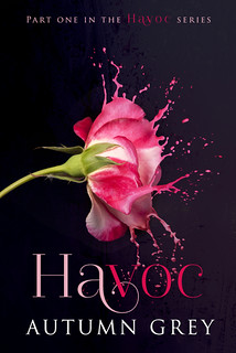
- Simple. I love simple, but touching covers. Not too many elements on it, but still able to convey the messgae and convey the right emotions. The cover for Havoc is a good example, it’s very simple, but still a stunning cover. Sometimes it’s better to focus on a few key elements than try and cram too much on a cover.
- Nature. I love nature and a nice nature setting on a cover is a sure way to get my attention. This is similiar to me preferance for a nice background, but having a nature background or nature featuring on the cover, makes me even more happy.
- Animals. I like seeing animals on the cover. I am a big animal lover and often an animal on the cover means that anials play a part in the story, which is something I like. And they are cute, so I like seeing them on covers.
- Unique/ original. I love unique or original covers, covers that are different from what I used to and that catch my attention just by being different. Everyone loves the beautifull dress covers, but they aren’t very original. I like covers that do things a bit different.
Covers Featured in this post.
As this post is about covers I picked a few covers I like to display durign this post and let me tell you why I pciked these covers.
- Havoc (Havoc #1) by Autumn Grey It is bad to admit I mostly picked up this book because of the cover and the fact I heard good thgind about it. I like the black background with the splash of briliantly pink. I like how the flower looks like a flower, but is also dissolving in paint. I still have no clue why covers like this fit erotica/ romance books though as I haven’t seen the connection of the flower with the story, but ah well. It certainly is an eye catching cover.
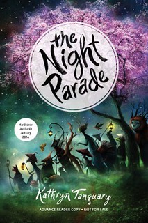
- The Night Parade by Kathryn Tanquary This is one of those books were the cover grabbed my attention. The tree and the creatures walking udnerneath it, obviously hitns to the blurb and the title which both mention the night parade. It also has a japanese feel which fits the story.
I really don’t like when there are people on the cover ESPECIALLY a cheesy looking couple. Plus I think it is super embarrassing walking around carrying a book with a cover like that. A perfect example of this is Obsidian. I don’t mind ones like The Selection because I think it really goes with the story as opposed to looking cheesy. The girl in the dress says a lot. But yeah people on the covers – not my favorite!
My favorite element of book covers are the font. I really think that the font can make or break how nice the cover looks most of the time. I like how books are starting to feature pretty fonts with simple backgrounds!
That’s what handy about an e-reader, no one can see how the cover looks. I am not a fan of the cheesy looking or half naked covers. The Selection does has have good cover and they fit the story.
I agree a good font can really make something of even a simple cover.
Those are good reasons to like/not like a cover. I don’t mind people on the cover, but I don’t like it when the head is cut off. I don’t like it when I can figure out what the cover has to do with the story or if models are nothing like the characters. My favorite covers are those that capture the essence of the genre and story inside, but I am as guilty as the next person of spotting a gorgeous or fascinating cover and wanting the book for that alone. 😉
I don’t mind models on a cover too much, but just a slight preference for covers without models. As long as the model is done well and fits the book I like them. Well said, a cover that captured the essence and feel of the story inside is the best. And a gorgeous cover can always catch my attention.
Oops! That third sentence should read ‘when I CAN’T figure out what the cover has to do with the story’.
I agree if a cover has models I want them to fit the descriptions and story. Or at least see some kind of connection.
Those are great things to like about a cover. I however love to see people on a cover. As long as they fit the characters and their heads aren’t cut off. I’m so turned off by headless torso’s. I like to see eyes. But beautiful, colorful backgrounds are really a must too.
The headless torse on covers is a bit overdone indeed, not a fan of those, unless they manage to make it unique. I don’t mind people on a cover too much, but prefer covers without them. If there are people on a cover having them fit the description or story is a must. And I think backgroudn have lots of potential as well.
I love so many different covers but I hate anything cheesy and some of those historical romances have ghastly covers. The one cover I really loved was Station Eleven by Emily St John Mandel, my ARC was white with a pink picture and was incredibly striking.
I like cover that are a little bit different than normal. I am not a fan of most historical romance covers, but I’ve seen some nice ones as well. That Station Eleven cover you have sounds pretty, I think pink can be a very striking colour on a cover especially when contrasted with black or white.
“No people” 😀 I’m more fond of symbolic covers, where I don’t actually see a human face. I don’t mind silhouettes, though, as long as they’re vague. I think it’s to do with the fact that having people forces my head to see if the models match the description in the book. I agree that the Night Parade has such a beautiful cover! Reminds me of the anime Nurarihyon no Mago hehe.
Yes I think that’s part of the reason why I like models less, that way I am instantly trying to compare the model with the description or I can’t let my own imagination run wild. I like covers with models were you don’t see their face, like Burying Water for example or silhouettes are good too! I haven’t heard of that anime, will have to check out.
I don’t have much time to comment, but I agree with you. And as much as I like sexy men on covers, they end up looking all the same ! One of the covers that struck me recently is The Crow talker by Jacob Grey 😉
As long as they can make the cover a bit special or different I don’t mind, but indeed the sexy men covers often tend to look the same. I looked it up and I agree the Crow Talker has a nice cover indeed!
If there are models on the front..they need to resemble the characters. Not a blonde on the outside and a bubbly red-head inside. I like all covers..it is a combination of color, font and images. I love when the cover and title click as you are reading the book.
Having the model resemble the characters is a must in my opinion of there are models on the cover. I like covers, I really should find a way to talk about them more often on my blog. And yes that moment when the cover and title click is always fun 🙂
I don’t like people on the cover unless you can see their faces. Otherwise, they throw of my imaginative conjuring and I always picture the person on the cover as the character. I like thinking up characters on my own.
I also prefer not to see the faces, that way my imagination works better. I like forming an image of the person on my own.
I like bright colors and nice fonts. I especially like it when the cover fits the story or the title. I don’t mind covers with people on them because I usually skip over the physical descriptions of characters. I rarely know what anyone I’m reading about looks like! At least having them on the cover gives me a starting point, even if it’s wrong lol.
I don’t always read physical descrptions of character, but even then I prefer to form my own image of what they look like instead of having the cover already show me how they look. I always form some sort of image of what the characetrs look like, even if it might be wrong.
Bright colors and nice fonts can defnitely be a good thing on a cover. I also like it when the cover, story and title have a connection.
I like covers with objects or illustrations on them too. And color! I love lots of color 🙂
Colours can really make a difference on a cover :).
I could tick nearly all the same boxes as you. My fav colours are pink and purple and when I see them on a cover, I’m immediately attracted to it. I also prefer books without real people on them, or else people in profile as I just prefer not to see their faces. I like finding out about them from the book. And I want the cover to mean something, it should match the theme of the book. And simple, I love simple, uncluttered covers.
My favourite colour is green. I think pink and purple can be stunning on a cover and I love it when a colour really shines on a cover. I agree profiles or from the back is better than seeing their face,m I like it when covers leave the face of a character ot the imagination. Covers that fit the book are the best. I love simple covers, when there are too many elements on a cover it get’s too busy for me.